the country kitchen
restaurant brandingDescription
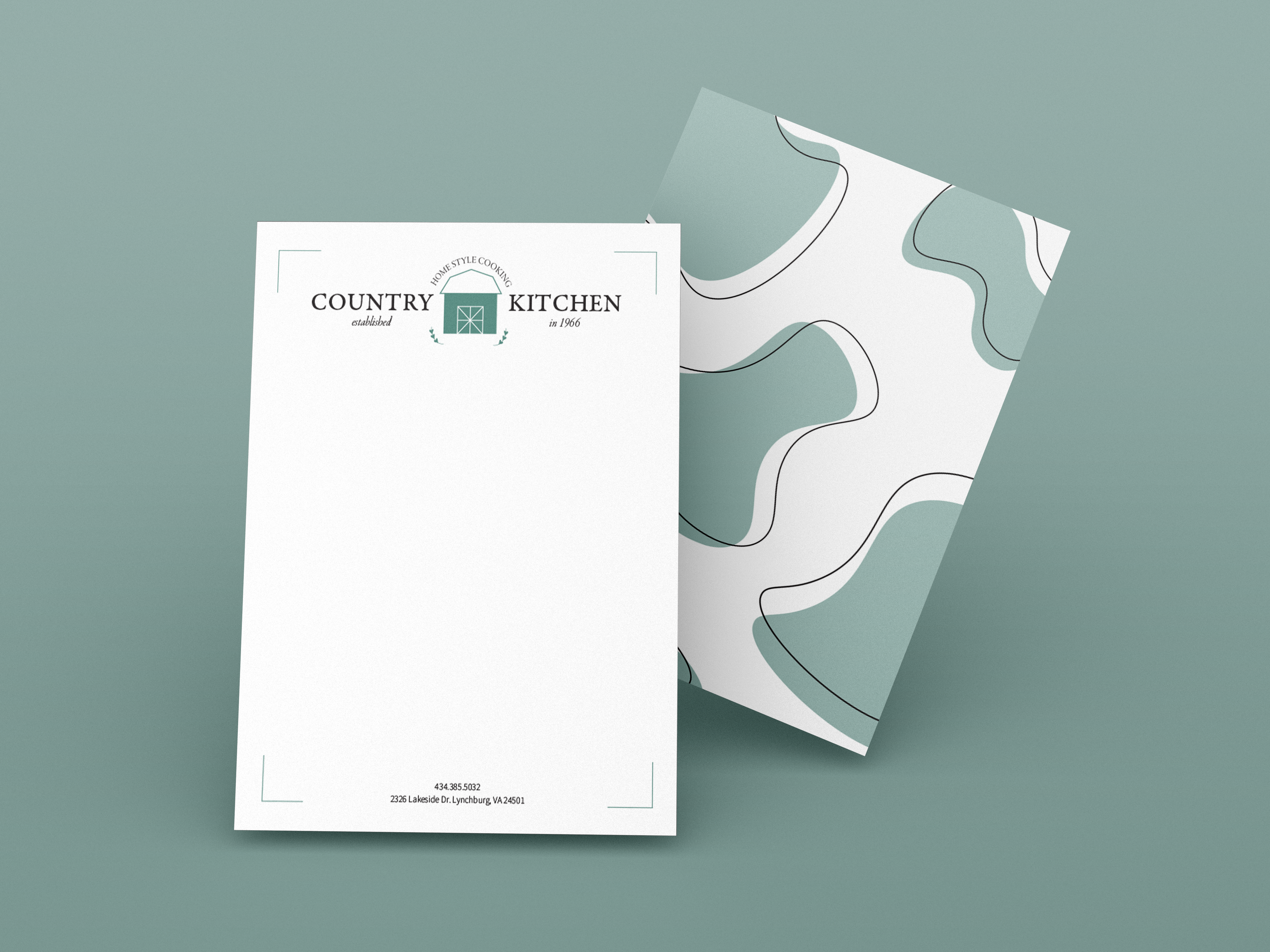
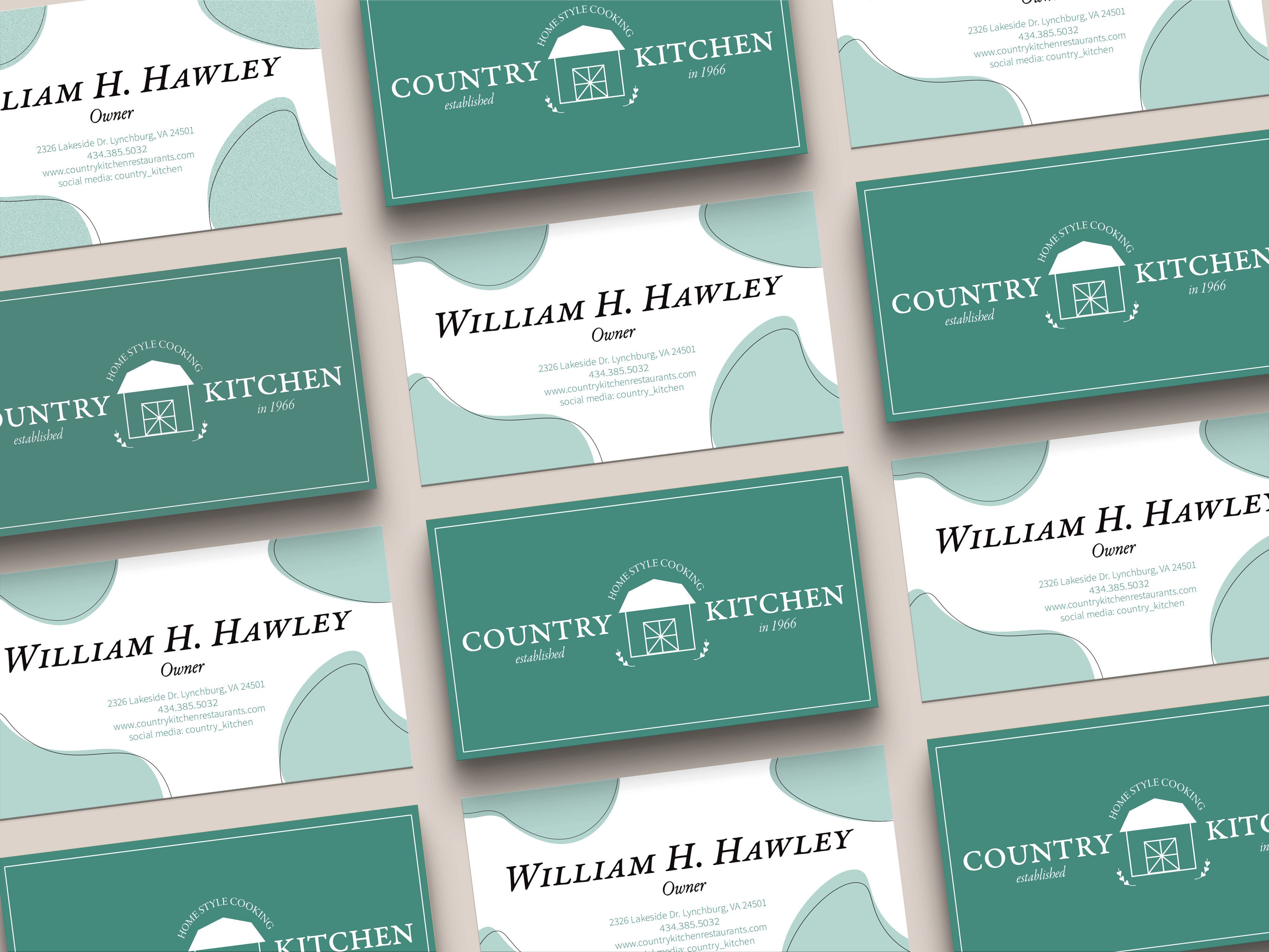
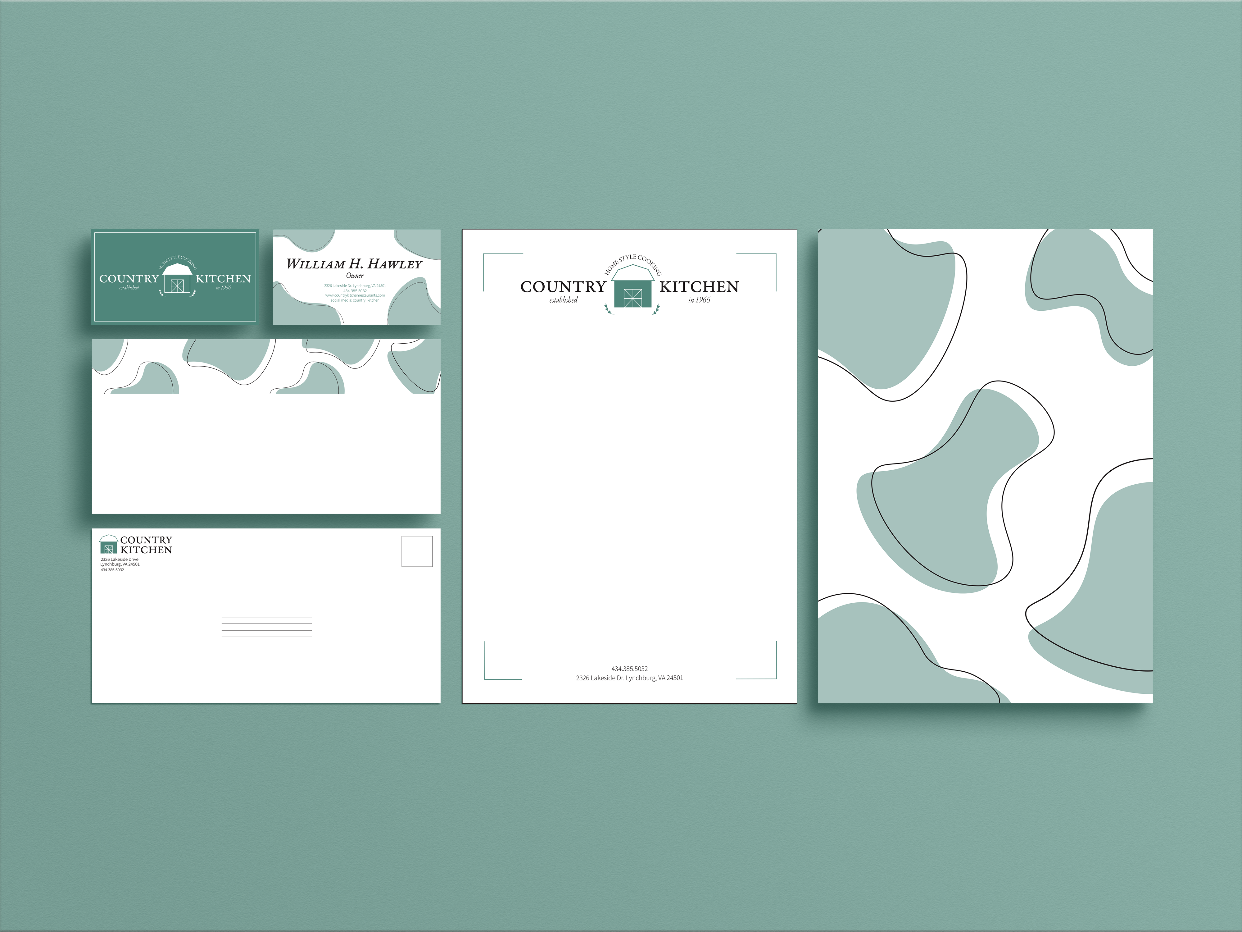
For this project, we were required to create an identity package for a restaurant of our choosing, in this case, I chose “The Country Kitchen”. Throughout this project, we rebranded the restaurant’s original logo and applied it to the front and back of a letterhead, envelope, and business card.
I utilized an organic, natural color palette of various greens and blacks in my package to capture the earthy, homey, farmland aesthetic that is often correlated with the country. For the title of the restaurant, I used a font that looks handwritten and was a bit grungier than the others, yet still clean and easy to read, allowing for the logo to appear more homemade.
As for the arched slogan above the barn icon, originally I used a small, thin cursive-style font. This decision ended up making it more difficult to read and understand, so I used a different variation of the title font and capitalized it to give the logo a cleaner look that was more visually appealing. The original design also didn’t include the greenery illustrations at the bottom, but when I added them, it completed the circular illusion that was created by the slogan, allowing for a more polished look to take place.
I also created, by hand, a variety of odd shapes to put on the back of the letterhead, the business card, and the flap of the envelope in order for repetition and cohesion to occur throughout the course of my design. These shapes were intentional in the way that they looked and where they were placed so that they resembled cow spots, tying back to the farm animal aspect of the countryside.


Photos: Country Kitchen stationary on the left, and business card mock-ups on the right.

Photos: Country Kitchen stationary, business card, and letterhead mock-ups.
