travel brochure
new york city brochureDescription
For this project, our class was required to create a travel brochure for a destination of our choice, in this case I chose New York City. Throughout the course of this project, we had to include high-quality images and descriptions of the destination’s attractions, food, and transportation while maintaining a demonstration of the four principles of design in our work.
I utilized a neutral background, incorporating light pastels, whites, and blacks throughout the majority of my design to allow for the photos and descriptions in the brochure to stand out. The descriptive paragraphs and tight spacing between each item on the inside of the pamphlet capture the hustle and bustle atmosphere and aesthetic that New York City is known for.
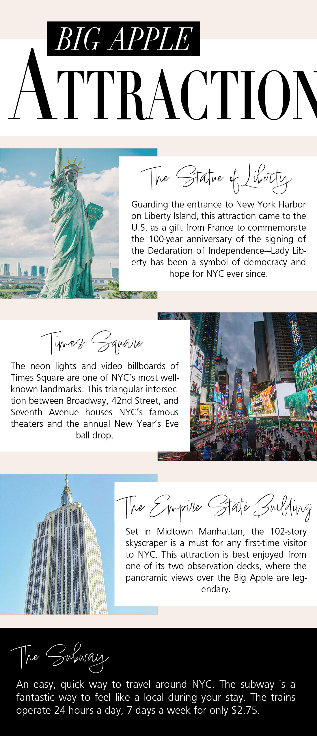
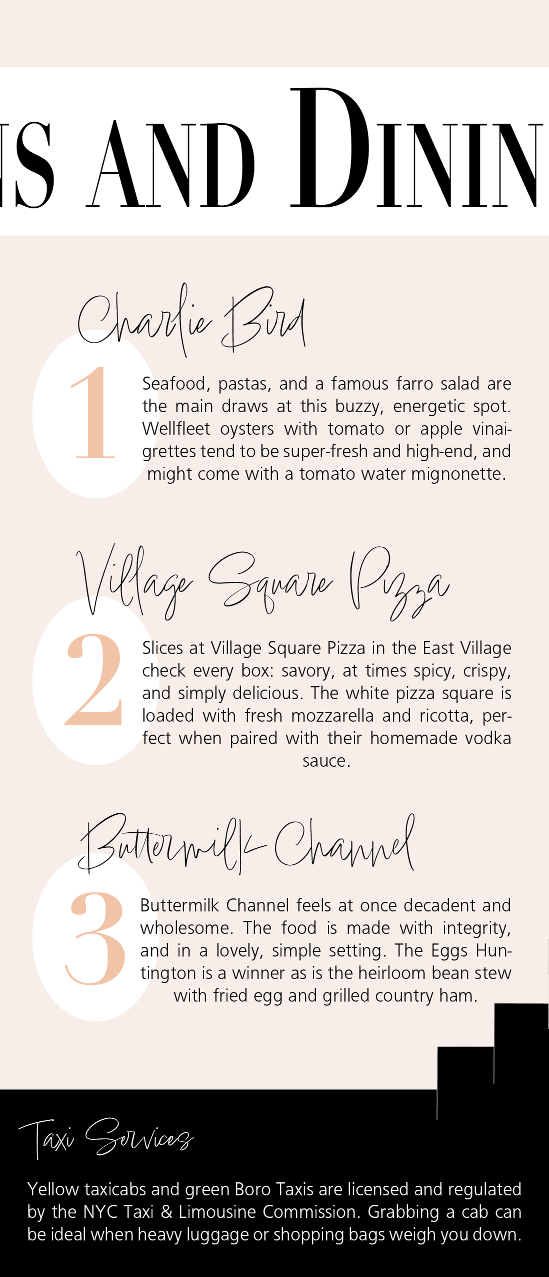
In order to add more contrast to my design and allow the titles (“Big Apple Attractions and Dining” and “Big Apple Transportation”) to pop off the page, I alternated the colors of the rectangular backgrounds with the color of the font I was using. For instance, if the background was white, the title would be black, and vice versa. I presented the dining options in a list format, utilizing repetition and alignment techniques, by adding oversized numbers and allowing for an overlap of the restaurant titles and descriptions to take place. Thus making the brochure more visually appealing, concise, and organized.
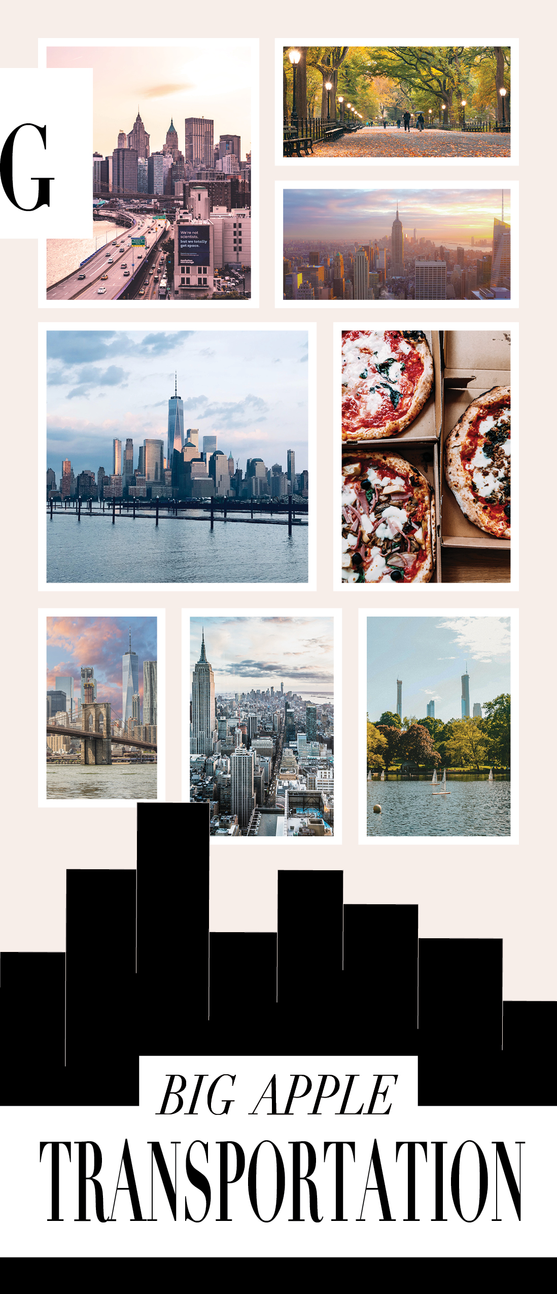
I also incorporated silhouettes of the famous city on the inside and outside of the brochure to allow for repetition and continuity between both sides. As for the photo collage on the third column, originally I had each photo overlapping each other, however, this ended up being too overwhelming to look at. Therefore I framed out, edited, and separated each photo evenly, making the visuals easier to process.
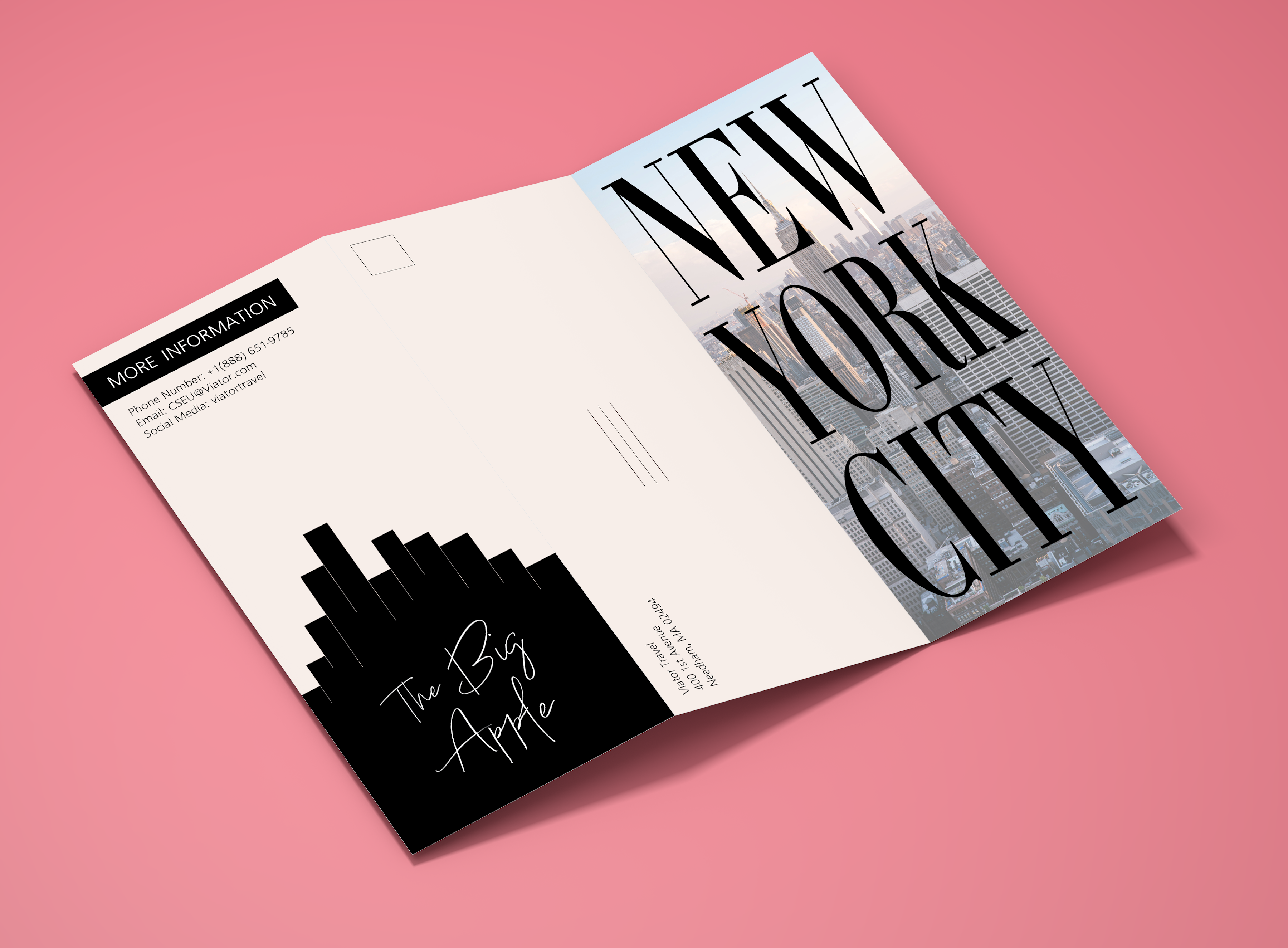
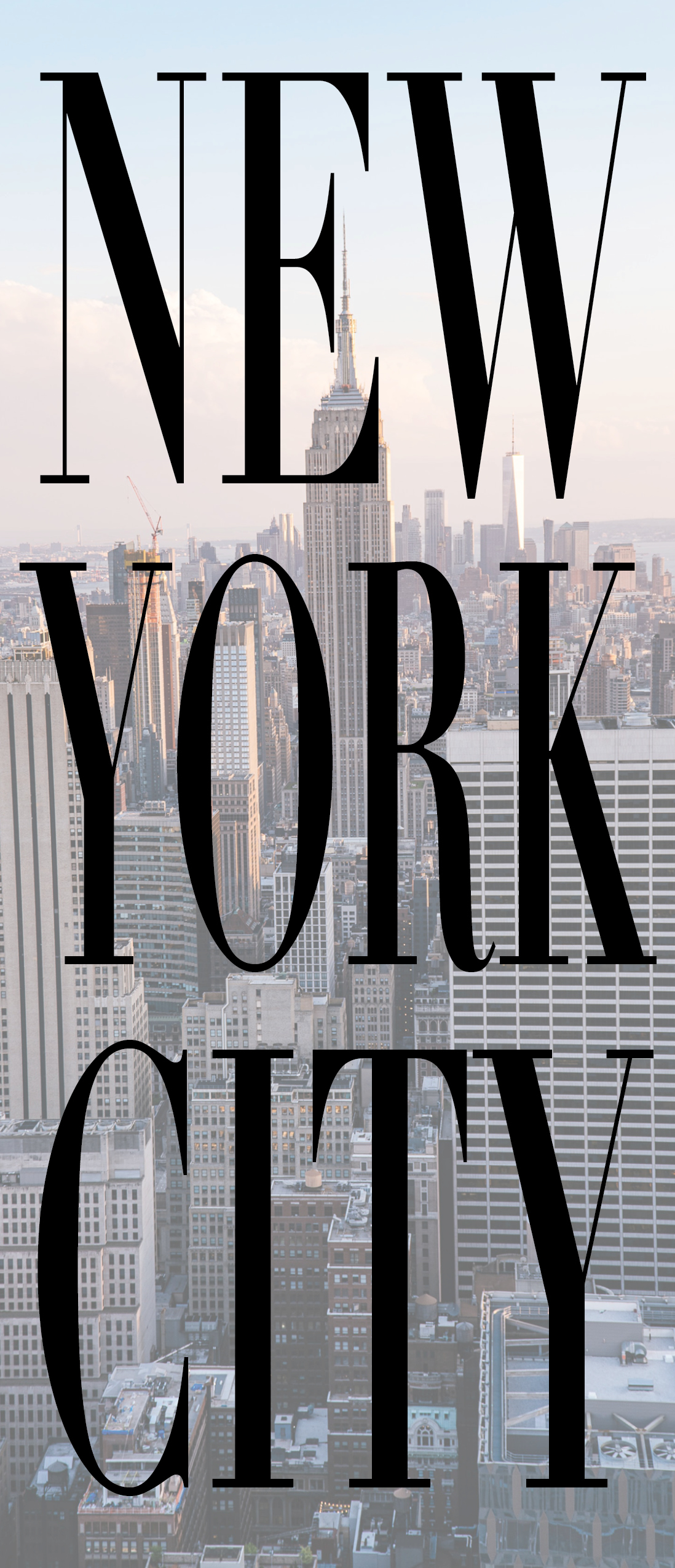
Photo: Exterior of the NYC travel brochure.
Photo: Flat layout of all six sides of the travel brochure.
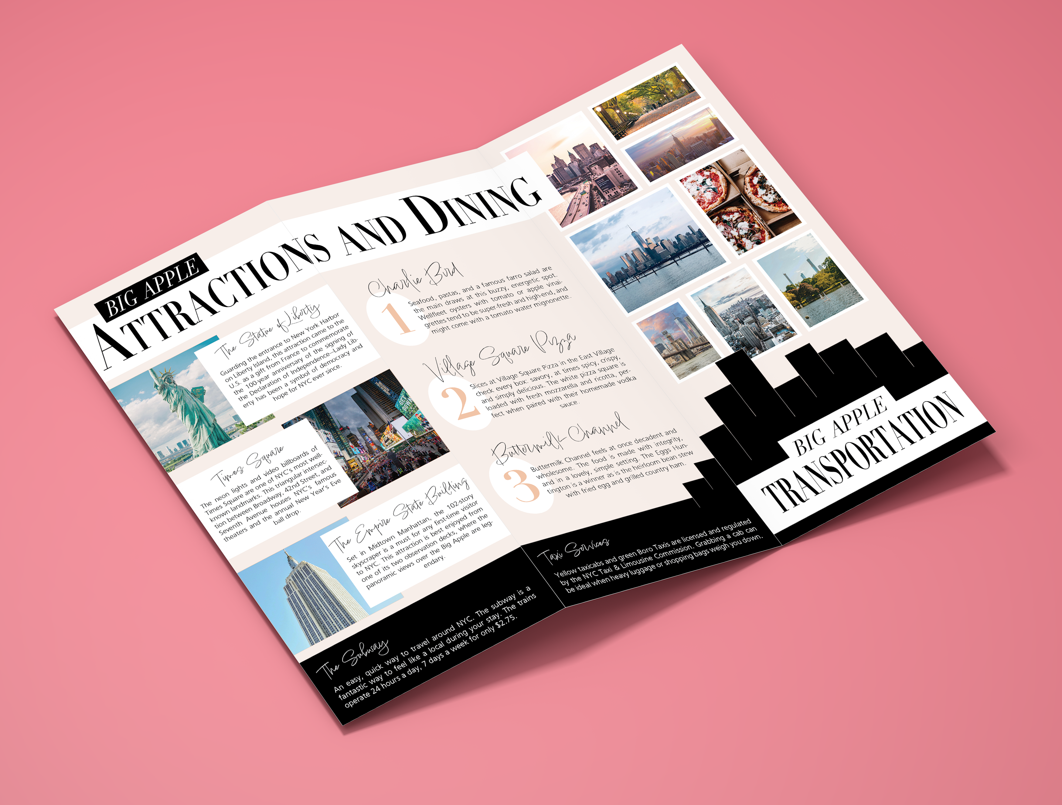
Photo: Interior of the NYC travel brochure.

